The Pocket Code: Corporate Language, Queer Semiotics, and the Embroidered Body
Sometime in the early 1970s, in the bars and bathhouses and back rooms of San Francisco and New York, gay men began to develop a visual grammar of desire. The mechanics were simple: a bandana, folded into a triangle and worn hanging from the back pocket. Colour indicated preference; side indicated position. The system was practical, born of necessity in spaces where language was dangerous and silence was survival, but it was also something more than practical. It was a semiotic architecture, a means by which bodies could communicate across rooms, across the noise of music and the opacity of strangers, in a code that was invisible to those outside it and perfectly legible to those within. The Hanky Code was queer culture encoding itself into the material world.
I have been thinking about this system for a long time. Long enough that the bandanas have become a kind of obsession, a stack of them in every colour I could source, sorted and resorted, held up to the light. What I kept returning to was not just the elegance of the code itself but the question of what else was already encoded in the same vocabulary. What other systems were using this language of appetite and service and submission and pleasure, without ever admitting it?
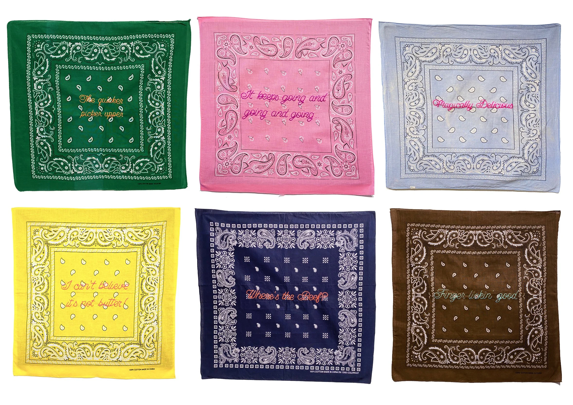
BARCODE (2026) is my answer to that question. Seventy hand-embroidered bandanas, arranged in pairs by colour, constitute the full exhibition: each pair corresponding to a position within the code, left pocket and right pocket, each bandana bearing a corporate advertising slogan embroidered in cursive thread at the centre of a traditional paisley ground. The slogans are drawn from decades of North American consumer culture: fast food chains, household products, pharmaceutical companies, national institutions, automotive brands, candy manufacturers. Their vocabulary of appetite, service, endurance, pleasure, and submission maps, with varying degrees of distance and precision, onto the erotic semantics already encoded in the fabric beneath them.
The result is a work that operates through collision and convergence, through the gap between what corporate language intends and what it inadvertently describes. To read BARCODE is to become aware, suddenly and uncomfortably, of how much the language of consumer culture has always been about the body: its hungers, its capacities, its thresholds, its willingness to be acted upon. I did not impose this reading. I found it already latent in the archive of slogans, waiting to be placed on the correct ground.
BARCODE opens at Red Head Gallery on April 2, 2026. It runs through April 25.
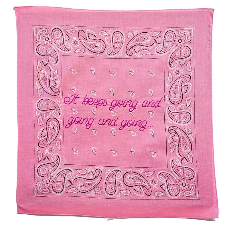
IT KEEPS GOING AND GOING ND GOING, 20×20in. Handembroidered pink bandana, 2020
To situate this work within queer art history requires first understanding the cultural weight of its material substrate. The Hanky Code was not merely a system of personal preference but a form of what the theorist Lauren Berlant might have called an intimate public: a structure through which strangers could recognise one another and negotiate encounter without the mediation of institutions or the risks of disclosure. It flourished precisely because it was illegible to the dominant culture, because its meanings were encoded in something as ordinary and unremarkable as a piece of cotton in a back pocket.
José Esteban Muñoz, in Cruising Utopia: The Then and There of Queer Futurity (2009), argues that queer culture has always survived through what he calls ephemera: the traces, gestures, and material objects that carry subcultural knowledge across time and between bodies. The bandana is exactly such an object. It is ephemeral in Muñoz's sense, not because it disappears, but because its meaning is contingent on context, on the body that wears it, on the space in which it circulates. The act of pinning these objects to a gallery wall and embroidering them with text is itself a kind of archival gesture, a refusal of ephemerality, a decision to make the code legible and permanent, to bring it from the back pocket into the institution.
This move carries a long history within queer art. The AIDS crisis of the 1980s and 1990s produced a generation of artists for whom the relationship between queer bodies, visibility, and institutional space was not aesthetic but existential. Gran Fury's billboard and poster interventions, ACT UP's die-ins, Felix Gonzalez-Torres's candy piles and billboard photographs: all of these practices emerged from the understanding that queer survival depended on a willingness to make the body and its vulnerabilities publicly legible. Gonzalez-Torres is a crucial ancestor for this project. In works like Untitled (Portrait of Ross in L.A.) (1991), he transformed the intimate materials of private life into public, participatory installation, asking viewers to take something away with them, to carry the work in their bodies. The bandanas of BARCODE are similarly portable objects, similarly invested in the tension between private knowledge and public display. An edition of three means that two of each pair can leave the gallery, can return to circulation, can be worn, can re-enter the subcultural economy from which they came.
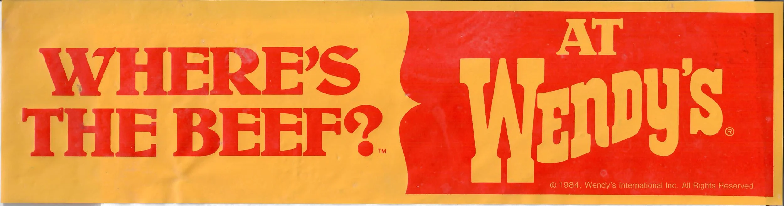
Wendy’s Advertisement 1984.
If the Hanky Code is one axis of BARCODE, the other is the language of consumer capitalism, and specifically the moment when that language began to colonise the rhetoric of queer liberation. The exhibition opens six to eight weeks before Pride season, and that timing is not incidental. Since the early 2000s, and accelerating sharply after the legal and cultural gains of the 2010s, Pride has been progressively captured by corporate sponsorship. What began as a riot and became a march has become, in many of its largest instantiations, a branded lifestyle event. The rainbow flag now appears on credit cards and fast food cups and limited-edition sneaker collections.
Naomi Klein's No Logo (1999), written at the precise moment this transformation was accelerating, documented how multinational brands were shifting from the marketing of products to the marketing of identities, how corporations were colonising the symbolic resources of subcultures and countercultures, extracting their meaning, and selling it back to them drained of its political content. What Klein could not have anticipated was the specific target her analysis would eventually describe: the systematic incorporation of queer identity into brand strategy, the deployment of rainbow capitalism as a mechanism for neutralising the radical potential of LGBTQ+ politics while retaining its aesthetic appeal.
The slogans in BARCODE are drawn from the period of high consumerism, mostly the 1970s through to the 2000s, the same era as the Hanky Code's development and deployment. This temporal overlap is essential to the work's argument. The slogans and the code were contemporaneous. They shared cultural air. The vocabulary of corporate appetite and consumer pleasure was developing in exact parallel with the vocabulary of queer desire, and the formal discovery at the heart of BARCODE is that these two linguistic systems are not merely analogous but structurally homologous. Both are systems for encoding the body's relationship to pleasure and service. Both use the language of desire to produce compliant subjects: one compliant in their consumption, the other compliant in their eroticism. The difference is that the Hanky Code was honest about what it was.
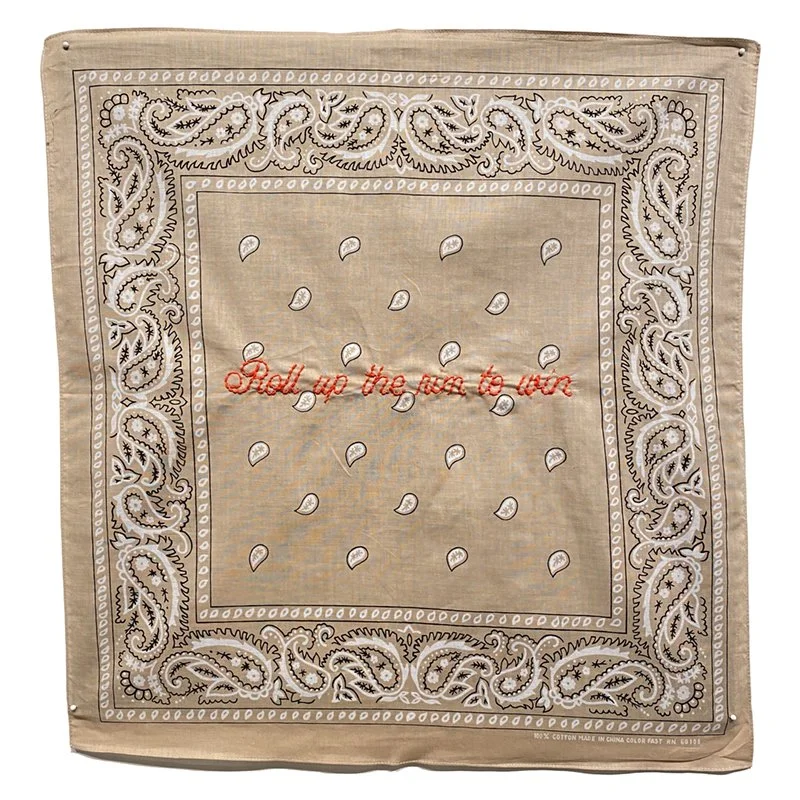
ROLL UP THE RIM TO WIN 20×20in., Handembroideery on beige bandana, 2020
The beige pair is perhaps the most elegant demonstration of this structural homology. Beige in the Hanky Code signals rimming, a practice simultaneously intimate, abject, and joyful, one that queer culture has always been more willing to discuss frankly than straight culture. The slogans I chose are Cleans round the bend (a toilet cleaner) and Roll up the rim to win (Tim Hortons). The corporate language is not metaphorically reaching toward the erotic meaning. It is describing the same spatial and tactile geometry, in the sanitised vocabulary of domestic hygiene and coffee culture. The beige fabric is itself aged and worn, carrying the patina of use. What the slogans scrub clean, the fabric remembers.
The choice of embroidery as the medium for inscribing these slogans is not decorative but deeply theoretical. Embroidery carries a specific history within feminist art practice, a history of reclaiming a feminised craft form as a site of serious artistic and political production. From the feminist textile practices of the 1970s, which revalued domestic craft as both artistic medium and ideological critique, to the needlework of artists like Tracy Emin, whose blankets and quilts convert intimate personal narrative into public confrontation, to the extraordinary embroidered works of Elaine Reichek, whose sampling practice sets hand-stitched patterns beside canonical texts to expose their ideological contents, embroidery has a sustained tradition of using its domestic associations as leverage against the authority of official discourse.
I came to embroidery through a different route, through crochet and textile and the long queer history of making with your hands. But the moment I started stitching these slogans into the bandanas, I understood what the medium was doing that no other medium could do. The cursive script is the handwriting of care packages and Valentine's cards and sampler mottos. It is intimate, feminine in its associations, the opposite register from the declarative boldness of a corporate logo. And yet what it transcribes are corporate logos, the authoritative declarations of brands that have spent billions constructing their visual identities. The needle transforms the corporate into something handmade, time-intensive, close. Each slogan represents hours of work, the repetitive physical engagement of needle and thread, the proximity of my body to the fabric. This stands in complete opposition to the production logic of corporate identity, which is designed to be instantly reproducible, endlessly scalable, produced without the trace of individual human effort.
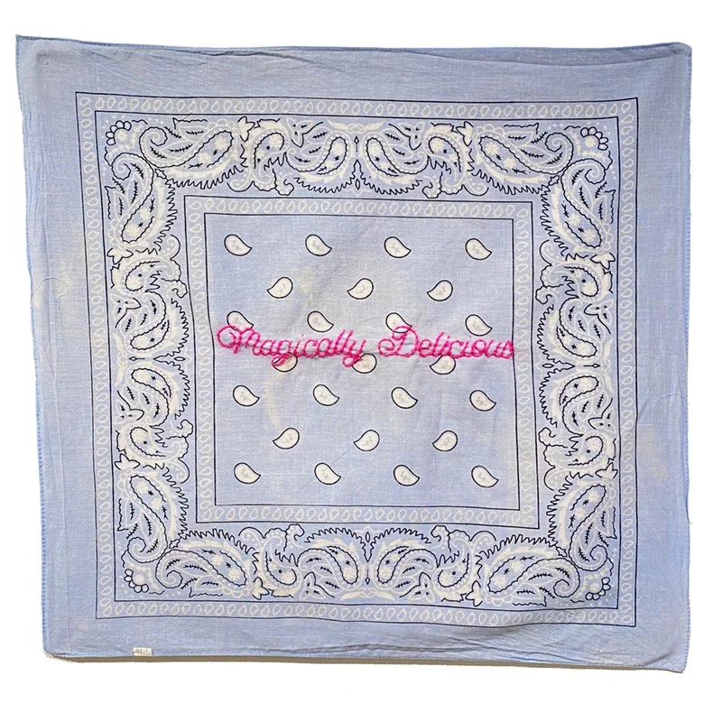
MAGICALLY DELICIOUS 20×20in. Hand embroidered light blue bandana, 2022
The most theoretically rich pairs in the series are those where the gap between corporate intention and hanky meaning is smallest, where the slogan, stripped of its advertising context, reads as a direct description of the coded act. The light blue pair is perhaps the most formally precise in this regard. Light blue left signals oral top; light blue right signals oral bottom. Melts in your mouth, not in your hand (M&Ms) requires no interpretive work at all. The slogan is already there, already describing the act, already deploying the language of sensation and preference and location. The advertising team at Mars Inc. was, presumably, not thinking about fellatio. And yet here it is, in perfect alignment, waiting.
Magically Delicious (Lucky Charms) on the right, embroidered in hot pink thread against the faded denim-blue ground, introduces a different register: the language of enchantment, the magical transformation of the ordinary into the extraordinary. This is also, of course, the rhetoric of camp, the elevation of the common into the fabulous, the insistence that the everyday contains hidden dimensions of pleasure and spectacle. Eve Kosofsky Sedgwick, in Tendencies (1993), argues that queerness is fundamentally about the refusal of the ordinary as a stable category, about the recognition that even the most normative surfaces contain unpredictable erotic charge. The Lucky Charms slogan performs this recognition precisely. These are also the two bandanas now in the permanent collection of the Ottawa Art Gallery, acquired by collector Bill Staubi and donated as part of a gift of over twelve hundred works. The institution has, whether it fully registered this or not, acquired two works whose entire meaning depends on understanding the Hanky Code. Melts in your mouth, not in your hand and Magically Delicious are now in a public collection. I find that genuinely moving, and a little bit funny, and entirely right.
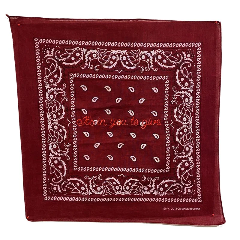
IT’S IN YOU TO GIVE 20×20in., Hand embroidered dark red bandanas, 2022
The dark red pair operates at a completely different register: not comic but political, not playful but indicting. Dark red signals blood sports in the Hanky Code. It's in you to give is the slogan of Canadian Blood Services, the organization that maintained a blanket ban on blood donations from men who have sex with men from 1992 until 2022, when it was finally replaced with a more equitable screening policy. I have thought about this pair more than any other in the series. The slogan, placed on this ground, is a direct confrontation with the history of that exclusion. The gay body that was told its blood was contaminated, dangerous, unacceptable, the body that was told it had nothing to give, speaks back through the institution's own language of generosity and civic duty. The violence of the irony here is not aesthetic. It is historical.
Good to the last drop (Maxwell House) on the right introduces a mordant comedy that does not lighten the political weight of the pair but redirects it: the consumer's total satisfaction, the extraction of every last unit of value from the product. On a blood sports ground, after the Blood Services slogan, this reads less like a coffee advertisement and more like a statement about what the institution was willing to take from queer bodies during the AIDS crisis while refusing them the reciprocal gesture of civic participation.
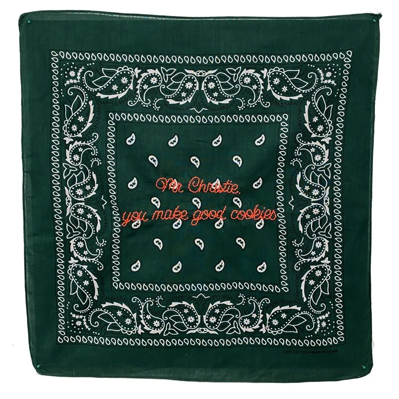
MISTER CHRISTIE YOU MAKE GOOD COOKIES 20×20in,. Hand embroidered hunter green bandana, 2020
Several of the most resonant pairings in BARCODE operate through specifically Canadian cultural references, and this specificity is not incidental but constitutive. Roll up the rim to win is not merely a coffee slogan; it is a Canadian civic ritual, a seasonal collective participation that has been described by cultural critics as a form of national identity performance. Mr. Christie, you make good cookies is a domestic reassurance that belongs to a particular mid-century Canadian childhood. Do you eat the red ones last? (Smarties) encodes a generational Canadian debate about candy consumption that is meaningless outside this country.
By placing these culturally specific references on the hanky code ground, BARCODE is doing something more than general consumer critique. The work argues that Canadian national identity, its particular brand of cheerful, polite, domestic consumer culture, has always carried an erotic unconscious that it has systematically refused to acknowledge. The Canadian corporate voice, with its emphasis on community, warmth, shared ritual, and domestic pleasure, is revealed as a sublimated erotic vocabulary. The Tim Hortons cup that millions of Canadians hold every morning contains a meaning they are not supposed to notice.
This connects BARCODE to a longer tradition of Canadian queer art practice that has engaged specifically with the tensions between Canadian national mythology and queer experience. General Idea, the Toronto collective whose practice spanned from the late 1960s through the 1990s, consistently deployed the visual languages of consumer culture, television, and national spectacle to expose the ideological operations concealed within them. Their interventions into official cultural forms, beauty pageants, international art exhibitions, national magazines, used the codes of legitimacy against themselves, revealing the normative violence embedded in seemingly innocent cultural structures. BARCODE inherits this method: using the official language of consumer culture as a mirror in which queer experience becomes suddenly, uncomfortably visible.

The seventy bandanas of BARCODE operate within the tradition of the serial artwork while departing from it in a crucial respect. Where many conceptual series achieve their effect through formal austerity, through the reduction of visual incident to a minimum, BARCODE is visually lush. The grounds are saturated and varied; the embroidery is cursive and warm; the fabrics carry their own histories of use and manufacture. Each pair is distinct in its visual register: the geometric aggression of the checker, the worn patina of the cream, the deep formality of the hunter green, the sun-bleached beauty of the robin's egg blue. The series makes its argument through abundance rather than reduction, through the tactile variety of the material world rather than its conceptual bracketing.
This abundance mirrors the Hanky Code itself, which is also a system of multiplicity, not a binary but a spectrum, a near-infinite gradation of colour and meaning that maps the full range of human erotic possibility. The choice to work across the full code rather than selecting a small number of colours was itself a decision about what this project needed to be. I wanted the inventory, the catalogue, the queer taxonomy of desire that insists on the full range of what bodies do and want and need. Nothing omitted. Nothing tastefully edited out.
The theorist Jasbir Puar, in Terrorist Assemblages: Homonationalism in Queer Times (2007), coined the term homonationalism to describe the process by which a sanitised, depoliticised version of gay and lesbian identity has been incorporated into nationalist and neoliberal frameworks. Corporate Pride is a local, commercial expression of this broader dynamic. By entering the cultural conversation before Pride, BARCODE positions itself as a critical framework through which Pride might be read, rather than as a protest that arrives after the fact. Viewers who encounter the work in April will carry its questions into June. When they see the rainbow branded packaging, the corporate floats, the sponsored activations, they will have already spent time looking at what happens when the language of consumer pleasure and the language of queer desire are placed in direct contact.
BARCODE does not argue that corporate culture has stolen queer culture's language. It shows that the language was already shared, that the vocabularies were always overlapping, that what corporate Pride has done is exploit an existing homology rather than manufacture a false one. This is the more unsettling argument. It implicates consumer culture in queer desire at a structural level, suggesting that the relationship between capitalism and sexuality is not one of colonisation but of co-constitution.
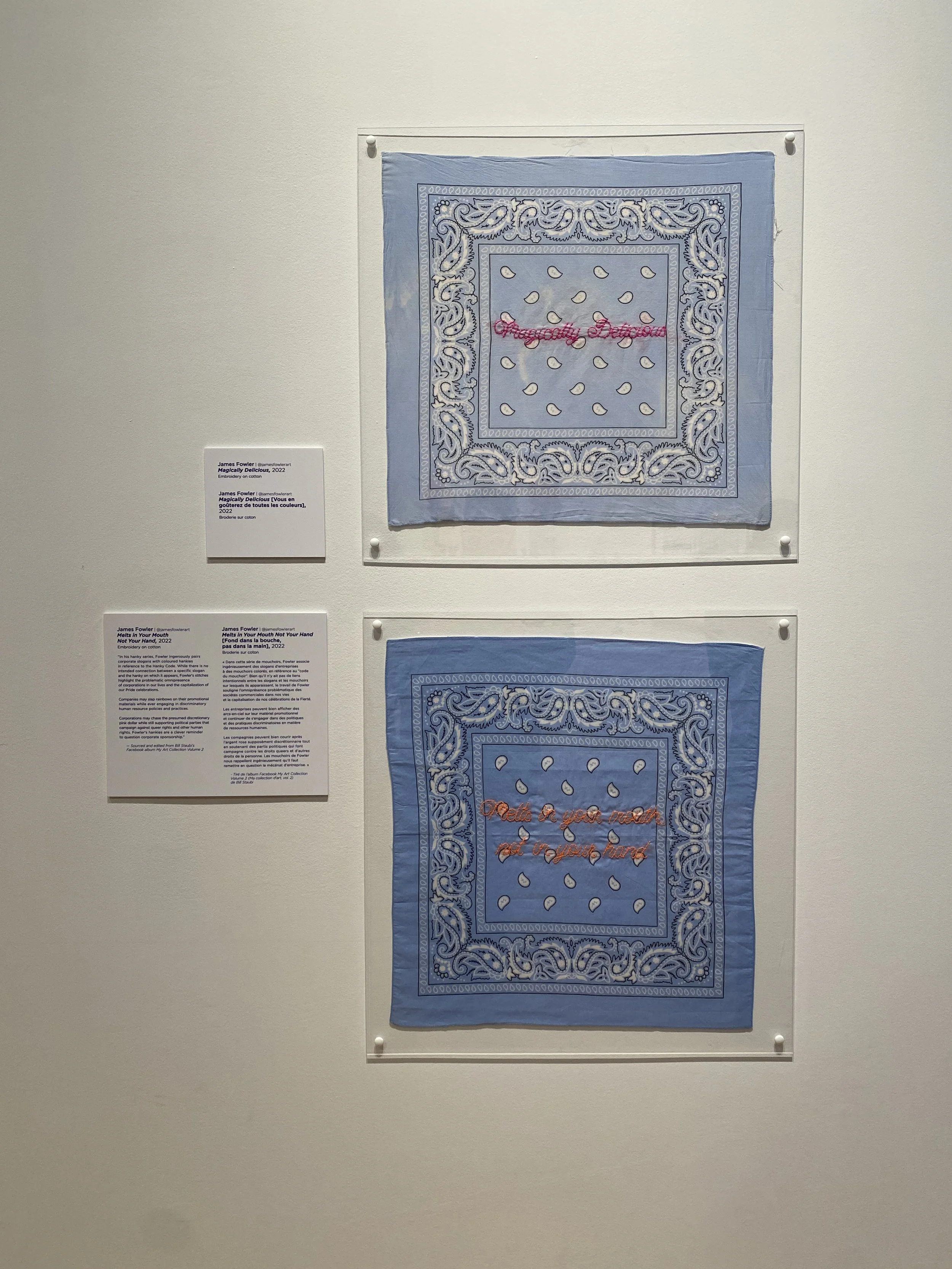
Installation view, in Grotto: The Bill Staubi Collection, Ottawa Art Gallery. March, 2025.
It is also, in the end, an act of love for the code itself. I mean that without irony. The ingenuity of a community that built a language out of cotton and colour, that found a way to speak across distance and danger, that encoded an entire erotic cosmology into something you could fold in a pocket and walk out the door: that deserves to be honoured. By bringing that language into contact with the language of the corporations that have sought to incorporate and neutralise queer culture, BARCODE is not mocking the code. It is demonstrating its resilience. The Hanky Code can survive this juxtaposition. It remains more honest, more precise, more human than anything that has ever appeared on a billboard.
BARCODE opens at Red Head Gallery, 401 Richmond Street West, Toronto, on April 2, 2026 and runs through April 25. Free embroidery workshops take place on April 18 and April 25. Admission is free.